

Hi again, this time the TableView “Metro” style gets added to the JMetro JavaFX theme. This amps up the JMetro version to 3.1.0.
The reason why I didn’t add the Table style before is because strangely there isn’t yet a definition for the Table in the Fluent Design System (previously Metro). There is a preview control, called DataGrid but is still in preview and will only be officially added later.
The JMetro Table style is a custom made style I’ve done based on the Fluent Design System’s other controls and guide lines.
As usual there is a Dark and Light theme.
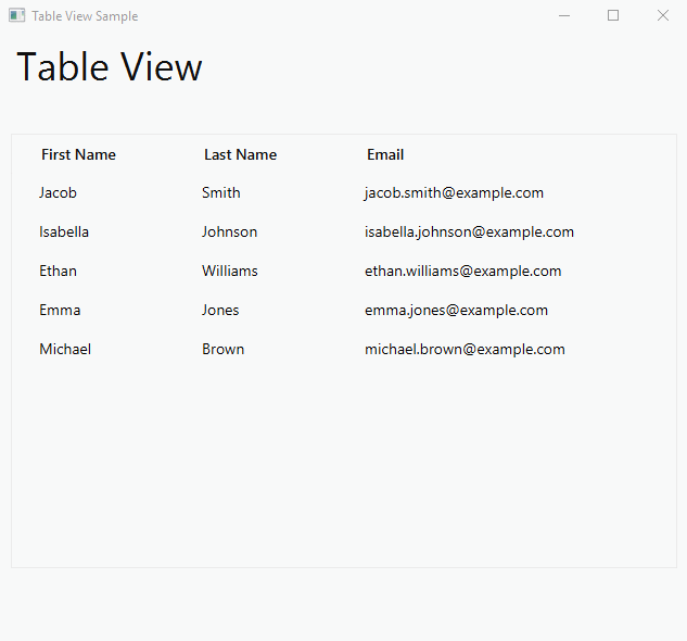
JMetro Table View – Light Theme
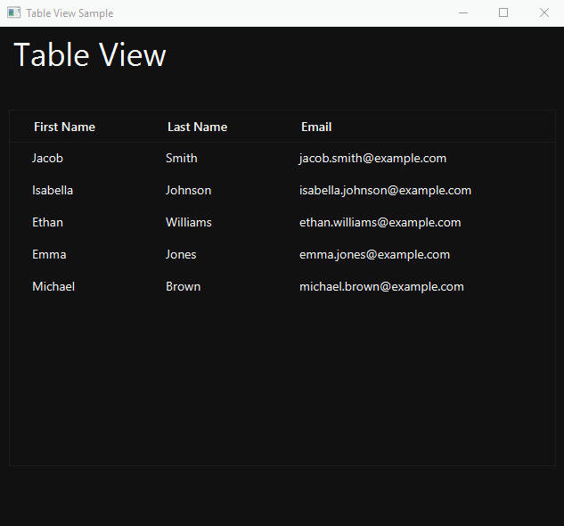
JMetro Table View – Dark Theme
If you’re familiar with the standard JavaFX theme (Modena) you’ll also notice that the JMetro arrow that appears when sorting a column is different.
The border around the table in the dark and light themes are not part of the control style. It was added to the table in the sample app.
In the light theme there is a light border below the header row that is not visible in the GIF. It is visible in a PNG image:
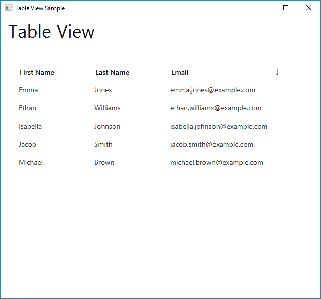
Table View with the border below the header row
These are the relevant fixes that have been made in version 3.1.0:
- Fix toggle switch style showing with rounded corners
As usual check out the JMetro documentation page for information on how to use JMetro theme.
Further Developments
In the next weeks my intention is to make the further improvements to the library:
- Add TreeView style
- Improve Radio Button style
- Improve Check Box style
- Improve Toggle Switch style
- Add the ability to change the accent color and other colors easily through a code call or CSS definition
- Etc
As usual follow me on twitter and subscribe to this blog if you want to stay up-to-date with the latest news.