

Contents
Introduction
Parallax framework for Java (JavaFX). This framework adds controls to add Parallax effects to JavaFX application, this effect can add a sense of depth (3D like) to where it’s used.
For an introduction to what is a Parallax effect, how and where it’s used, and the early implementation of the first control added to this library, ParallaxListView, check out this blog post.
How to get it
The Parallax framework ParallaxFX is a free open source library.
The source code repository url – https://github.com/dukke/FXParallax.
Library files (Jar, Javadoc, source code) – You can download them here. They are also available on Bintray as a Maven dependency (replace version number with the version you want):
<dependency>
  <groupId>com.pixelduke</groupId>
  <artifactId>FXParallax</artifactId>
  <version>2.0.0</version>
  <type>pom</type>
</dependency>
Please send me pictures of your application using FXParallax to:  , it’s useful for me to know how the library is being used and make adjustments accordingly and also, if you allow, to showcase example uses.
Details
FXParallax is composed of a set of controls that are either already ready to use and have a parallax effect or are a general purpose control that makes it easy for you to add a parallax effect to a UI component.
ParallaxPane
ParallaxPane is a control that creates the ability to add a parallax effect to any Node subclass. The API is pretty simple all you have to do is set the Node you’d want to have a parallax effect added to, by calling setContent(Node).
ParallaxPane automatically takes care of what position of the content to show depending on the ParallaxPane’s screen position.
The video above shows a demo of the ParallaxPane, two ParallaxPane’s exist in this scene, both containing an ImageView object. As you can see those two ImageView’s have a parallax effect.
These are the images that have been used:

The following code snippet shows an example of how you can define a ParallaxPane, in this case we’re setting an image (through the use of ImageView) as the ParallaxPane’s content:
VBox vBox = new VBox();
ParallaxPane parallaxPane = new ParallaxPane();
String url = ParallaxPaneWithImageTest.class.getResource("small-business.jpg").toExternalForm();
parallaxPane.setContent(new ImageView(url));
vBox.getChildren().add(parallaxPane);
ParallaxPane also has a convenience method that you can use when you simply want to set an Image as its contents. That method is conveniently called setImage, and receives an Image object. You can also use the constructor that receives a Node or the constructor that receives an Image object.
If we wanted to have it defined declaratively, in FXML, it would look like this (using the convenience constructor that receives an Image):
<VBox styleClass="main-container">
  <ParallaxPane styleClass="first-image">
    <image>
      <Image url="@small-business.jpg">
    </image>
  </ParallaxPane>
</VBox>
Relevant API
Content
This is the most relevant property, it lets you specify the node which you want the parallax effect to be added to.
verticalSizeDifference
This property functions much like the sizeDifference property of ParallaxListView, described below. But for now it’s only implemented with vertical scroll in mind. You shouldn’t need to specify this property as it already has a sensible default value.
Current limitations
ParallaxPane, for now, only adds parallax effect for vertical scroll.
Blog posts about this control
AnimatedScrollPane
AnimatedScrollPane, is just like the ScrollPane but adds an extra interesting effect by having the scroll be animated. Modern applications, like for instance Google Chrome, usually scroll their contents through an animation.
AnimatedScrollPane has the same API as ScrollPane, in fact it extends from ScrollPane.
In the future there might be a ScrollPane skin that you can use, so you can add animated scroll to a regular ScrollPane.
Current limitations
The current limitation is that, for now, it’s implemented with only vertical scroll in mind.
Blog posts about this control:
ParallaxListView
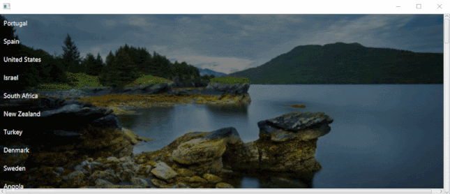
Above is a GIF of the ParallaxListView, image quality and animation in live version is better. ParallaxListView is, for all purposes, a ListView with a Parallax effect. It works pretty much like the JavaFX ListView, having an equal API (although it’s not a subclass of ListView) with a few added properties.
Like the JavaFX ListView, it has an items collection that you can populate by calling getItems() or passing the items in its constructor. If you’d like you can, like in ListView, set your own custom cell factory.
One of the other properties that is also available is orientation which may be set to horizontal or vertical.
API not present in ListView
BackgroundImage
One property that has obviously been added is the backgroundImage property. Changing this property will change the background image behind the list of items.
Any image that’s set through this property will be resized so it fills the background of the control while still preserving its aspect ratio (so the image won’t be deformed). This means the image may stretch outside the control.
DefaultScrollAmount
DefaultScrollAmount property controls how much scroll is done by default when the user does a scroll action (like for instance scrolling with the mouse wheel). This property has the default value of 150. The time it takes to scroll will always be the same, what changes is the travel distance of the scroll.
SizeDifference
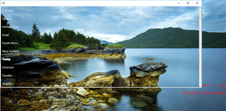
The sizeDifference property controls by how many pixels is the background bigger than the control (horizontally or vertically, depending on the orientation property). The default value is 100, if this value is set to 0 there will be no scrolling of the background as the whole image will be showing from the start. The aspect ratio of the background is always preserved.
Styling through CSS
The style class of this control is parallax-list-view. ListView is a direct child of parallax-list-view and the styling is exactly the same as ListView from that point on (.parallax-list-view > .list-view).
There are a few CSS styles that are applied by default to ParallaxLisView which you can obviously override. One example is the background overlay that is set by default with a black color and an opacity of 0.3:
.parallax-list-view > .list-view {
    -fx-background-color: rgba(0, 0, 0, 0.3);
}
Examples and further reading
The test folder has a couple of self-explanatory test examples.
If you want to check out more information on FXParallax, like for instance implementation details, check out the FXParallax blog post category.
Issues and contributing
If you want to support the development of this library consider a donation or sponsoring a feature or bug fix.
In case you want to contribute, you’re welcome to file a PR.
If you just want to make a request for a feature or a bug fix, you can file an issue in the issue tracker: https://github.com/dukke/FXParallax/issues. You’re welcome to do it but in this case there is no guarantee of when I’ll be able to address it, it depends on how much free time I have and priorities, please be patient.